Posted tagged ‘politics’

Debate Hub: How Did C-Span Get So Cool?

2, October, 2008

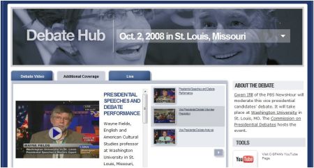
C-Span–the tediously even-handed, eat-your-spinach, 24-hour civics lesson–has somehow caught the Cool2.0 virus. As you prepare for tonight’s debate between Sen. Loose and Gov. Moose, check out C-Span’s Debate Hub.

Okay, nothing that special here–your basic interactive platform that lets you dig into the debate several different ways.

But the cool thing is this: Using the hub, you can pluck snippets of video in near-real time, snag the code and circulate it to make whatever mischief you want.

See a condescending Biden scowl? Grab it, post it to YouTube, and Tweet the url before he’s bloviating on the next question.

Like the way Palin crinkles her nose like a schoolgirl when she’s trying to discourage additional questions? Grab ’em and e-mail ’em to your brother in minutes!

You can mash the content up into comic repartee worthy of Neil Simon before Chris Matthews is on MSNBC praising Biden’s stalwart performance!

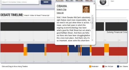
This is all possible thanks to the Debate Hub’s near-real-time debate timeline, which will spill out transcript and video as the action progresses. Here’s the timeline from the Oxford, Miss., debate between Obama and McCain.

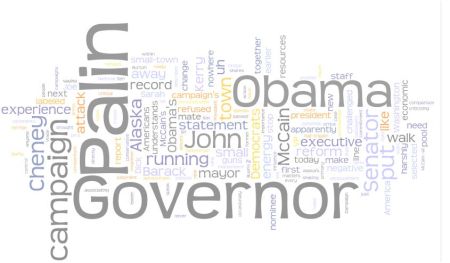
I suspect C-Span didn’t realize it was creating a mischief-o-matic when it launched this site. But it certainly knew it was stretching its brand image. Why else would it include this graphic representing the words used most in the debate by each candidate?

And why else would it publish a real-time Twitter feed? And live blog entry aggregation?

If C-Span–whose average viewer is probably about as old as John McCain–has gone so deeply into democracy 2.0, something truly revolutionary is happening with our politics.

People are participating in it.

Are we sure we want to encourage this sort of nonsense?

Time.com’s ‘The Page’: Like a Blog, But Better

17, September, 2008

There are more things wrong with Time.com’s renovated website than befits a multimedia news-and-content monolith. Maybe that’s due to the lingering toxicities of that whole nearly fatal AOL infection. But those flaws are a subject for another day.

Today I’d like to call attention to really smart evolution of the blog and into a successful new format: The Page, Mark Halperin’s daily dose of high-quality political news scrapery.

[Sorry for the lousy cut-n-paste. Those two images should read seamlessly, as one.]

There’s so much I like about this:

The items are essentially links to the full content on Time.com and elsewhere. This makes the blog an easy scan of current relevant news items, with one-click access to the full versions.

It’s all very visual, using big images, varied typographic textures and white space to make The Page highly scannable. Essentially The Page is a compelling front end for the news.

It’s built on WordPress!

Below the big entries of the moment, the bottom of The Page is a more conventional gathering of news items, but notice again how each is presented with scannable typography and written as if the blurber actually understands the content.

The Page is also pushed out as a daily e-mail.

The Page is an excellent evolution that combines blog, well-crafted blurbified news and next-gen e-mail. It’s one of the most usable products of this type I’ve come across.

The real value-add, as they say on the business side of the operation, is not the content, but Halperin’s brain. Instead of rewriting the news, he selects and presents it.

Flaws? Halperin should be more ecumenical in his item choices, so the product remains a gateway to the political news of the day, not Time.com’s news reporting of same.

Oh, and this: Is the title “The Page” ironic, retro-cool or, for all of the product’s digital virtues, an artifact of the creators’ ink-and-paper-centric worldview?

Conflict of interest note: In a moment of weakness, Time.com several months ago declared this humble blog a Top 25 blog.


Bookmark and Share

Dataviz of the Week: Failed States [Other than Ours]

10, September, 2008

As we brace for the hysterical doom-and-bloom rhetoric of the general election, what better time than now to explore cases of real national failure and success?

The image above is a datavisualization of The Failed States Index, a report co-published by the Fund for Peace and Foreign Policy magazine. It evaluates 177 countries in terms of how close they are to, well, failure. [More on this below.]

As I have confessed repeatedly here, I’m a big fan of “dataviz,” as it’s known in the trade. Data visualizations demonstrate the power of images to illuminate information in ways that words alone cannot. I think journalists, educators and all professional communicators ignore dataviz at their peril.

Anyhow, the Failed States map is pretty simple as these graphic explainers go. The work of a map geek who goes by the handle “Ender,” the dataviz essentially turns each country’s failure index number into a color, allowing you to eyeball the places on the world map where countries are teetering on the edge of national catastrophe.

The visuals force fascinating questions to mind:

  • Is it significant that so many states near failure are located near the equator?
  • Why do nations seem to be stabler the closer they are to the North and South poles–with the glaring exception of Russia?
  • Why makes Ghana so much more stable than Guatemala?
  • What measures of national stability rank Portugal above the U.S.?
  • Why are China and Russia closer to failure than Cuba?
  • What happy sauce do they drink in Chile that makes that nation as stable as our own?

Which brings us back to the underlying data.

The Failed State Index is a calculation based on information about each country regarding 12 criteria, a research-and-analysis process that’s been vetted and validated by multiple layers of academics and globalist wonks.

Measures of national stability accounted for include Legacy of Vengeance-Seeking Group Grievance or Group Paranoia,Uneven Economic Development along Group Lines,” Suspension or Arbitrary Application of the Rule of Law,” “Widespread Violation of Human Rights,” “Progressive Deterioration of Public Services,” “Rise of Factionalized Elites,” and “Sharp and/or Severe Economic Decline.”

Maybe I’ve been following the presidential race too much, but this sound a lot like the talking points of the guests on both MSNBC and Fox News.

Obviously, people in this relatively stable nation-state of ours are very polarized over the forthcoming presidential election. I’m already hearing people recite the common refrain, “If [the other guy] wins, I’m moving to Canada.”

But why choose our neighbor to the north, which is hardly more stable than Austria, for god’s sake?

Using the handy Failed States datavisualization, it’s easy to see that if you’re looking for a rock-solid haven free of political instablity to sit out an unbearable presidential administration. . . Norway is the place to go.


Bookmark and Share

Exclusive Photo: Sarah Palin as a Goldwater Girl!

4, September, 2008

Let’s imagine the presumptuous VP nominee Sarah Palin was a teenage Goldwater Girl, an earnest young Republican back in the day when Sen. Barry Goldwater rocked the house at the 1964 RNC.

Here’s what she might have looked like as a candy striper at the 1964 Convention:

This wonderful bit of trickery comes to you thanks to www.yearbookyourself.com. It’s a tweaky tool that lets you upload a photo of yourself, mess around just a bit, and produce an image of what you might have looked like had your yearbook photo been snapped during various years from 1950 through 2000.

But: Here we go again, we eliteliberaleastcoastmediaestablishmentrunningdogs having sport with Palin rather than taking her seriously. Palin, 44, was born in 1964.

So to set the record straight, here is what she may indeed have looked like around the time she really graduated, 1981:

[A tip o’ the fez to the always-ahead-of-the-pack Very Short List Web e-mail newsletter for the pointer to yearbookyourself.com.]

p.s. By popular demand, the author at his 1952 graduation.


Bookmark and Share

Obama and McCain’s Blogs, Writ Large

3, September, 2008

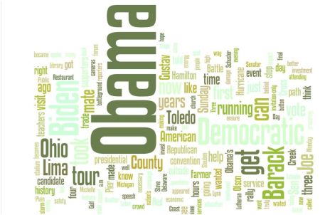
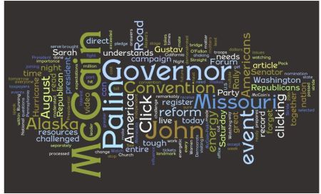
A while ago I wrote about a very cool tool called Wordle. You stick a URL or feed into the tool and it produces a visualization–a word cloud–that demonstrates how often words are used in a particular document or blog feed.

Just for sport, I compared results from an official Obama blog and an official McCain blog.

Obama’s blog:

And here’s McCain’s:

Fun stuff: The candidates talk a lot about themselves. Obama’s focused on Ohio, McCain on Missouri. Obama’s often used words: “get” and “can.” McCain’s: “reform” and “America.” Both write more about Gustav than each other.

Unfortunately, this isn’t an apples-to-apples comparison. The Obama blog I’ve Wordled is the campaign’s main one. McCain’s main blog doesn’t have a single RSS feed [the feeds are parsed by issue]. So I had to cut and paste text from a bunch of recent entries from McCain’s blog and let Wordle have at it.

As for McCain blogs that do have a single RSS feed, let’s look at what they’re talking about in the “McCain Report” blog, written by the trench-warfare-mustard-gas-tosser Michael Goldfarb.

That blog talks about Obama a lot.

Alas, no apples-to-apples there, either. Obama’s site doesn’t have a negative campaign blog.


Bookmark and Share

Obama’s “Explicit” iPod Playlist

1, September, 2008

There’s been a lot of light-hearted coverage about the music playlists of the two presidential candidates. They’ve been reported in various places in various ways for months, so I no longer have faith that any is the “real” playlist endorsed by the candidate himself.

Still, I was surprised when I was playing around in the social community of Microsoft’s Zune and found Sen. Barack Obama’s playlist presented this way:

Barack, you naughty dude! “Explicit” lyrics on your playlist!

The work in question: Kayne West’s “Touch the Sky.” The song is properly described by Zune staff as full of “hope and inspiration,” telling the tale of West’s rising awareness that there’s more to life than wealth and fame.

But the song wins its bad boy badge with a few lyrics that might make Cindy McCain’s shiny blonde beehive spin like a tornado. Let’s take a listen.

[Note to anti-Obama bloggers, GOP chop-shop bottom-feeders and Swift Boat wanna-be’s: Cut and paste below for maximum impact in your echo chamber.]

Back when Gucci was the sh*t to rock,
Back when Slick Rick got the sh*t to pop,
I’d do anything to say “I got it”.
Damn, them new loafers hurt my pocket.
Before anybody wanted K-West beats,
Me and my girl split the buffet at KFC.
Dog, I was having nervous breakdowns,
Like “Damn, these niggas that much better than me?”

Obama has met with rappers and the hip-hop community as part of his campaign to reach young people. For instance, read  Billboard’s brief on West’s performance at the DNC. Hip Hop News featured this June report about Obama and hi-hop music:

I’ve met with Jay-Z; I’ve met with Kanye. And I’ve talked to other artists about how potentially to bridge that gap [between hip-hop and mainstream culture]. I think the potential for them to deliver a message of extraordinary power that gets people thinking (is massive),Obama told Jeff Johnson during BET‘s political special What’s In It For Us?.

Though he supports using Hip Hop as a catalyst for good, Obama is also aware of Hip Hop’s negative side too, acknowledging that messages of crime and misogyny overshadow the many positive aspects of rap music.

There are times, even on the artists I’ve named, the artists that I love, that there is a message that’s sometimes degrading to women, uses the N-word a little too frequently. But also something that I’m really concerned about is (they’re) always talking about material things about how I can get something; more money, more cars.

But the WayRight Machine will never be able to use Obama’s “endorsement” of “shameful” lyrics that “no child should hear” and that demonstrate “he is not ready for national leadership” [again, this is the cut-and-paste line for use in anti-Obama blogs].

If the right tries to run with this issue, they have some explaining to themselves of McCain’s musical favorites.

Suffice to say: “Dancing Machine” by Abba.


Bookmark and Share

RealClearPolitics: Winning the Digital Journalism Race

29, August, 2008

Not long ago I castigated Congressional Quarterly for presenting high-quality reportage on political polling via a blog. They’re missing a great journalistic opportunity–to present daily analysis of the latest state-by-state Obama vs. McCain polls in a way that takes full advantage of the interactive visual medium that is the new platform for journalism.

It’s a classic case of old media not understanding what to do with their great stuff. Failing to “unlock the value” of their work, as they say in the corner offices.

Anyway, I’ve since discovered that such a map–a dataviz, or datavisualization, in web argot–exists. Unsurprisingly, it’s the work of a new media firm unburdened by an analog heritage.

The map is produced by RealClearPolitics, an online-only political analysis operation.

The map is a thing of digital beauty, a tool that lets you dig into good polling data smartly analyzed and interact with it by imagining various scenarios.

What if current polling holds through November? [Results shown above, pre convention “bounce.”]

What if Obama wins Virginia and New Mexico and the rest of the ’04 results are unchanged? [Obama wins by a hair.]

What if McCain sweeps the rust belt of Pennsylvania, Ohio and Michigan? [McCain by a mile, even if he loses Florida, etc.]

You can base all of these scenarios on the latest polling data so you can see how realistic your own speculations are.

It’s great work, a simple dataviz that presents best-of-class information in a fully interactive way that delivers a very high level of public service. It’s “civic engagement” on a screen.

If old media doesn’t start winning this kind or race soon, there will be no doubt who will carry the contest for the media future.

No matter who the President is.


Bookmark and Share

DNC Exposes a Gap in the New Media Ecosystem

27, August, 2008

As part of my utterly ineffectual campaign to embarrass the journalism establishment until it capitulates to my irresistible wisdom, I’m doing my best to boycott mainstream media coverage of the Democratic National Convention.

There are 15,000 journalists in Denver. There are 4,000 delegates.

At a time when news leaders face the urgent need to reinvent themselves around crushing economic changes, they’re squandering precious journalistic resources earnestly covering an event that’s part infomercial, part pep rally and part goofball Americana parade. All right now, let’s listen to State Sen. Rhubarb Buttwhistle’s intro to Gov. Louis Meander’s tribute to Adlai Stevenson! Tough questions, you say? Tell me, Mdme. Janie, is this convention hat really from 1956?

Yo, journalists: Is this what you went to school for? Isn’t there a meth lab in a house jointly owned by a city councilman and a corrupt contractor catching fire back home or something?

So anyway, I figure this is a great time to check out the emerging media. You know, those bold, independent voices unfettered by the groupthink of corporate media and resistant to the virus of party politics.

I went looking for a source that pulled together an eclectic mix of the best independent voices from non-mainstream, non-corporate media. Certainly some new media visionary was at this task right now, mining the indie datastream for precious nuggets, producing a truly fresh, truly independent, crisply edited feed representing news and opinions spanning the spectrum of politics, age, gender, lifestyle, social class and headwear preferences.

Um, no.

I found four varieties of DNC blog aggregation going on.

Big Brands (Washington Post, The New Republic, Politico) These mainstream outlets simply have their staff use blogging software to get their content on the screen faster. Also saves money on copy editors. Independent? Not so much.

Digital Algorithmic Aggregators (DayLife, Topix) These wrap a skin of a harried producer’s choices around an armature of machine-generated content, usually from mainstream sources. Curated? Not so much.

Lefty Blogs (Huffington Post) and Righty Blogs (RedState). Interesting for three or four clicks. Then, very quickly, thin and stifling.

I spent well over an hour searching for a dispassionate curator who undertook the task of presenting an eclectic mix of high-value content representing a range of views, avoiding both mainstream news and an ideological filter. I searched in vain.

I guess it makes sense. Big media brands are invested in promoting their own folks. Lefties and Righties want to ventilate only the viewpoints their benefactors embrace. The machine aggregators just want to assemble eyeballs at the lowest costs.

All of this exposes an interesting gap in the new media marketplace. Lots of great independent content is being created from and about the convention. Nobody I could locate is making an intellectually honest attempt to select the highest quality stuff and make it accessible in a single place with a single RSS feed. If it included multiple media–pix, Tweets, videos, etc.–so much the better.

I know there’s an audience for this. I know there are people capable of producing this.

And yet. . .there it isn’t.

The digital media marketplace being what it is, I wonder if this task isn’t best suited to a journalistic foundation or university program. [This isn’t a grant proposal, honest.]

Of course, it’s entirely possible that there is a politically independent, journalistically sound effort to curate the best non-MSM content produced by a variety of sources coming out of the DNC in something like real time.

If so, I’d love to hear about it.

It would make my pitiful solo boycott of MSM DNC coverage so much more satisfying.

Worst DataViz Ever: CQ’s Poll Tracker

13, August, 2008

I often write about great datavisualizations–applications that use interactive graphics to illuminate a database in inventive ways. A great dataviz explains stuff in a way words alone cannot.

Today I’d like to pay tribute to one of the worst data presentations of the political season: Congressional Quarterly’s Poll Tracker.

Let me say first that it’s a great idea to take the most recent state-by-state presidential polling data from the most credible sources and update it daily. Put some experienced reporters on it so they’re not fooled by bogus numbers. This will produce an electoral map showing the latest polls in all 50 states. What more could an obsessive horse-race watcher ask for?

Unless you decide to just report the data in a blog, without connecting it to a map, and just leaving it in the order that the data comes in. Here’s what you get:

I thought this presentation looked eerily familiar. Then I recalled the two-year mobile broadband service contract I signed over the weekend. You know the way they print out those contracts on long receipt tape? And they have to fold it over four times just to get it in the bag? That’s what the CQ “dataviz” reminded me of.

This is a classic case of journalists not understanding that how you present data is just as important as the underlying data itself. Stick that daily-updated state-by-state polling data on a map, float the data on flash pop-ups and you have a powerful application, a real reader service and eyeball draw. Leave it in a blog and all that reporting. . .turns invisible.

To be fair, CQ does have projection data on a map for House, Senate and Governors races. It doesn’t appear to take the most recent polling data into account, but it toggles neatly between current landscape and projected election outcomes.

Oh, wait, look! There is a “President” map that presents the latest polling data! My mistake!

Oh, never mind. . .that’s the results from the 2004 election.

Their mistake.


Bookmark and Share

Parlor Game: Web Search & the Election

3, July, 2008

One of the fun parlor games of Election ’08 is to look at Internet data and figure out what they mean.

The answer may be “nothing,” of course.

But let’s play along and look at the latest Hitwise data on popular search terms.

HitWise, a company that tracks Internet traffic, tabulated the search words that sent people to John McCain or Barack Obama’s websites. [Here’s a press release about the findings on the candidates’ top Internet search terms. For more detail, visit the Hitwise blog.]

Let’s look at the arguably vital issue of healthcare.

“Health care” didn’t make Obama’s top 5 search terms in the first quarter of 2008. In the second quarter, health care took the number 4 slot. Q1’s top term was “gay marriage,” Q2’s “abortion.

Meantime, “health care” took the tops spots for John McCain in both Q1 and Q2.

So: Does this mean people already think they know Obama’s healthcare plan and don’t need to search about it on the Internet? Or don’t they have much interest in the issue?

As for McCain, do the searches mean his plan is little-known and people want information on it? Or do those interested in McCain care more about healthcare than Obama’s voters?

You never know.

Q2 Obama top 5 terms, in order: Abortion, Education, Environment/Global Warming, Health Care, Immigration.

Q2 McCain top 5 search terms: Health Care, Environment/Global Warming, Oil Prices, Immigration, Education

Make of this what you will. But it’s worth noting that the economy does not make the top five for either candidate.

One final observation. The search term “Rumors” accounted for 5 percent of searches in Q1. In Q2, that number doubled. “Religion” dropped from 12 percent to 7 percent between Q1 and Q2.

Retreat to the parlor and discuss, please.