Archive for the ‘journalism’ category

Atlantic.com: Putting the “Re-” in Reiterations

7, October, 2008

The Atlantic.com, web outpost for the improbably long-tenured U.S. magazine, has debuted another iteration. I’ve lost count of how many sub-launches of the site there have been just since I’ve been paying attention.

But that’s good. From where I sit, multiple iterations are the way to progress on the web. Too often web developers sit for months creating a grand castle,  worrying the details until it’s just “right.” But time passes, opinions multiply, and eventually the grand castle is released as a McMansion with a scrim of Google ads running down the side. Three years later, another team is back at it, with pictures of a new castle up on the conference room walls.

Theatlantic.com, by contrast, just keeps pushing out upgrades every few months. Each one gets better, and creates subsequent opportunities to correct and change course.

Here’s the new masthead, which anticipates the printed magazine’s new retro look:

And here’s editor James Bennet’s explanation of what’s going on.

Key detail. A news-ish feature called “The Current” has been renamed “Dispatches.” Good move. “Dispatches” I understand. “The Current”. . .not so much. More proof that on the web, clear beats clever every time.

Longstanding grievance: How could an operation that “gets it” so well still view the website as a way to sell subscriptions to the petroleum-and-lumber version of the magazine, so much so that it is willing to degrade web user experience in the process of pushing pulp? Witness:

FOUR FREAKIN’ PROMPTS TO SUBSCRIBE TO THE PRINTED MAGAZINE, ABOVE THE FOLD, OCCUPYING THE MOST VALUABLE REAL ESTATE ON THE WEBSITE.

Stop that, I tell you, stop that!

Web 2.D’oh! Roundup: Wikipedia Abuse, Washington Fashion, More

19, September, 2008

Why Wikipedia Must Be Stopped, Cont’d

From The Times of London:

The Wikipedia entry for Sarah Palin was overhauled substantially for the better in the 24 hours before the surprise announcement of her selection as Republican vice-presidential nominee.

A mystery Wikipedia user — under the name Young Trigg — put in about 30 edits to the biographical article on the website…..

Since the announcement the Sarah Palin page has been edited many hundreds of times more and Wikipedia has now put in place a partial block so that only established editors can change the entry. Some of Young Trigg’s entries have been amended or toned down.

The blood-n-guts back story from WikiNews. The whole hideous editing trail. Wikidashboard’s view of who’s been up to what with the Palin entry.

Death by Manolo

The Washington Post has launched FW, a fashion magazine that appears to be modeled on the NYC fashion trade rag W. [FW stands for “Fashion Washington.”]

It’s easy, and maybe necessary, to ventilate one’s populist outrage by ridiculing a publication that says it will cover such topics as “hot-yet-approachable high-end styles,” “an ambassador known for dressing well,” and “a sizzling line of cufflinks just in from Japan.”

Who knows? This could help the paper snag some of the high-gloss ads that its Sunday magazine cannot. There are now several competing Palm Beach-y publications in the Washington area that do the usual party-pictures, pretty profiles and runway shots designed to appeal to high-end jewelers and clothiers that don’t usually fool with newsprint. They’re fat with ads so glossy they could generate solar energy. I guess the Post wants its share. Fine.

I just find it astonishing that a company like the Post–which is working furiously [in both senses] to create content and business models that will let it remain a source of vital, independent news reporting on public affairs in the digital world– would spend a single erg of energy creating a new print publication.

In economics there is something known as opportunity costs–the price, essentially, of the road not taken. Among the costs of Plan A one must include the costs of not doing Plan B.

In the case of the Post, the cost of launching FW includes the cost of not devoting those same resources to building products and business in the digital environment. Every worker-hour, every meeting, every salescall, every senior executive chin-pull, every synapse fired spent in service of making FW a success is not spent on the only task that matters.

Let’s say FW ekes out a modest profit at low costs. [On a per-rich-person’s-head basis, which is how FW’s being sold, the price is similar to that charged for ads in the newspaper’s Sunday magazine, though costs of FW will likely be a fraction. Good business plan.]

But the cost is that same group of people at The Post not developing skills, content, contacts and brainspan that will power the company into the almost purely digital news landscape that likely looms ahead.

I don’t care whether it’s footwear or football, diamonds or diatribes. Any investment in ink-on-paper products–even marginally profitable ones–by a company that has to remake itself in a digital world is a wasteful diversion.

It’s opportunity wasted.

Interest revealed: I am a former employee of The Washington Post newsroom.

And finally, our latest sighting of the Fifth Horseman of the Apocalypse ™

Grade your Twitter feed

Oh, wait, there goes the Horseman Again ™!

Social Networking Surpasses Porn as Leading Use of Internet


Bookmark and Share

Time.com’s ‘The Page’: Like a Blog, But Better

17, September, 2008

There are more things wrong with Time.com’s renovated website than befits a multimedia news-and-content monolith. Maybe that’s due to the lingering toxicities of that whole nearly fatal AOL infection. But those flaws are a subject for another day.

Today I’d like to call attention to really smart evolution of the blog and into a successful new format: The Page, Mark Halperin’s daily dose of high-quality political news scrapery.

[Sorry for the lousy cut-n-paste. Those two images should read seamlessly, as one.]

There’s so much I like about this:

The items are essentially links to the full content on Time.com and elsewhere. This makes the blog an easy scan of current relevant news items, with one-click access to the full versions.

It’s all very visual, using big images, varied typographic textures and white space to make The Page highly scannable. Essentially The Page is a compelling front end for the news.

It’s built on WordPress!

Below the big entries of the moment, the bottom of The Page is a more conventional gathering of news items, but notice again how each is presented with scannable typography and written as if the blurber actually understands the content.

The Page is also pushed out as a daily e-mail.

The Page is an excellent evolution that combines blog, well-crafted blurbified news and next-gen e-mail. It’s one of the most usable products of this type I’ve come across.

The real value-add, as they say on the business side of the operation, is not the content, but Halperin’s brain. Instead of rewriting the news, he selects and presents it.

Flaws? Halperin should be more ecumenical in his item choices, so the product remains a gateway to the political news of the day, not Time.com’s news reporting of same.

Oh, and this: Is the title “The Page” ironic, retro-cool or, for all of the product’s digital virtues, an artifact of the creators’ ink-and-paper-centric worldview?

Conflict of interest note: In a moment of weakness, Time.com several months ago declared this humble blog a Top 25 blog.


Bookmark and Share

Rick Sanchez Direct: CNN ADD!

8, September, 2008

Well, Rick Sanchez Direct was unloosed this afternoon onto an unsuspecting world. The CNN program appears to be the first head-on, full-frontal attempt by a mainstream media organization to harness the social web, live and on the air, to report the news.

Promoted on Sanchez’s own Twitter feed as a “Twitter show,” the production turned out to be more like a FriendFeed Gone Wild.

While Sanchez presented the news of the day, he harvested real-time viewer comments streaming in via Twitter, Facebook and MySpace [what, dude, you’re like 15?]. Raw news came in via cell phone images, mobile phone calls and user-generated video. There was even a multi-culti touch, with a flamboyantly Spanish speaking correspondent from CNN Espanol.

Sanchez is full of himself as a broadcaster and 2.0h geek–a brunette Anderson Cooper with ADD and thousands of online friends. His patter was peppered with references to the whiz-bangery by which he was presenting things: “…here’s something from Twitter coming in now, just seconds ago…this is an interactive news broadcast, it’s your show…and this, from Facebook…tell us what you think, we want to hear from you….”

Sanchez clearly relished his role as info-hero, manfully maintaining control of the real-time news battlefield while taking incoming data from all sides. At the end of the broadcast he thanked people for their “openness to Twitter, Facebook”–and indeed, one suspects, to human interaction itself. It was that kind of performance.

It’s easy to ridicule Rick Sanchez Direct as hyperspeed slapdash news-spatter. But truth told I found myself sort of liking it–the hour went fast, I got quick licks of the headlines-of-the-day, and heard the [alas, predictable] voices of my fellow Americans chattering about it all. There are worse news shows, and many that are more boring.

Which is not to say RSD is substantial or of great public value. But let’s consider the context before we bemoan the shameful intellectual decay of cable news–the domain of Wolf Blitzer, Sean Hannity and those blonde women on Fox–wrought by Twitter and Facebook.

Network TV news as it is widely practiced is highly mannered, with carefully staged standups, scripted stories, well-spoken talking heads and press conference snippets, all presented with assertive declamations by people who, as they say outside major media markets, clean up real good.

The thought that this somehow constitutes “news” in its pure form is ridiculous.

The thought that adding social media to the mix could wreck it is fatuous.

News is stuff that happens that someone finds interesting. There are infinite ways to present it. As the culture changes, so does the way it’s delivered.

My biggest complaint with RSD is that the need to generate a constant stream of real-time apoplexy to fill that Twitter screen, Sanchez & Co. will have to keep baiting the hook with red meat.

In today’s Episode One, the topics included “hard to watch” cell phone video of dead civilians in Afghanistan, a bunch of loony pastors who plan to take “all the way to the Supreme Court if necessary” their God-given right to endorse Republic–er, various candidates for public office, user videos of ginormous waves crushing the coastline of Cuba, the Government Bailout of Freddie and Fannie with Your Tax Dollars, etc.

And through Twitter and Facebook and god help us MySpace the people expressed their shock and disgust and dismay!

Sure, this is phony populism–“the issues that America really cares about,” overheated for the purposes of sensation. But welcome to our century. Later in the day, World News Tonight, Fox News and even NPR covered the very same stories, but without the public feedback.

As they say in the eye doctor’s office: Worse? Or better?

Is Rick Sanchez Direct a smart move for CNN? The 3 p.m. weekday time slot isn’t particularly valuable broadcast real estate. Why not turn it into a faddish, hyperkinetic, multi-screen, multi-media playground and see what happens?

Besides, think of the sponsorship opportunities.

For CNN sales reps, I have just two words: Red Bull.

* * * *

For more, see my previous entry previewing the program.


Bookmark and Share

Rick Sanchez Debuts Twitter on TV

8, September, 2008

Today at 3 p.m. EST, CNN’s promiscuous social media adopter Rick Sanchez debuts a TV show called Rick Sanchez Direct.

This may be of some cultural significance, in that that the program appears to be about/from/in/around [insert your favorite preposition] Twitter.

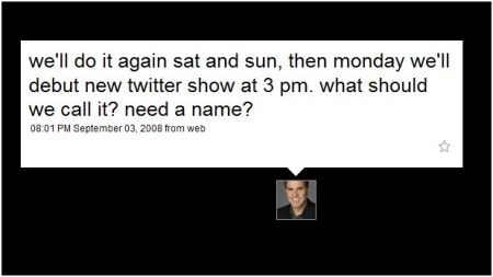
It’s hard to imagine the details of this first-of-its-kind broadcast. But in a Twitter message, Sanchez announced that it would indeed be “a Twitter show.”

Sanchez and other CNN anchors have been putting Twitter on camera as they report the news over the last week or so. Sanchez apparently had great sport with Twitter during Hurricane Gustav. I caught some of it, and it gave the news a sort incoherent, populist je ne sais quois I sort of admired. [See this Mashable entry for some details on CNN’s adventures in social media.]

Sanchez follows 4,607 people as of this writing. He has 8,766 followers. This appears to have generated some anxiety at Twitter’s San Francisco HQ, where the troops have been struggling mightily to keep the Fail Whale in its enclosure.

Sanchez’s producer Tweeted the following: **from Rick’s producer** working out a “follow limit” issue with Twitter. Stuck right now, unable to follow new folks.

Whether Sanchez will generate an entire show out of people’s messages to him, I have no idea. It’s hard to imagine how a Twitter feed from 4,607 users might behave live. The mind swims at the possibilities.

In his sign-off message Sunday night, just a little bit before I published this blog item, Sanchez Tweeted thusly:

heading out, c ya tomorrow THREE PM EAST, NOON for u california peeps, and everything in between. dvr, dvr, dvr,

Which is to say: Sanchez is asking us peeps to use our DVRs so we can time-shift a broadcast of his program that features Twitter. Talk about “appointment TV”!

As you can imagine, some see this as yet another sign that Da Man is appropriating social media in its evil plan to generate economic activity. You’ll find evidence of this on the blog Clips & Comment, in a post entitled  “Can Someone Shove CNN’s Twitter Screen Up Rick Sanchez’s A**?”

Dr. Sanjay Gupta, Code Blue!

* * * *

Note: The following added at 6:09 p.m.: For a review of the debut, see the next post.


Bookmark and Share

The Web 2.D’0h! Roundup

5, September, 2008

Another look at the menace, mediocrity and occasional magnificence around the world of social media.

Architects of the Doomed User Experience

Navigation Arts–a Washington, D.C.-area design firm best known for its work for defense contractors, trade associations and government agencies–has helped relaunch the Charlotte Observer’s website. A leader in usability and enterprise websites, Navigations Arts has produced. . .

. . .a site nearly indistinguishable from its peers that have stuck stubbornly with the newspaper-with-multimedia-and-nervously-managed-user-interaction model that has proven so incapable of producing sufficient revenues for newspaper publishers across the country.

To paraphrase the sounds of the season: Is this the change we need?

  • For community features the Observer it has deployed Pluck, the popular off-the-shelf 2.0-in-a-box application suite.
  • It uses the two-layer drop-down navigation you can find on any custom WordPress template worth $75.
  • It makes the misstep of labeling video as video [“hey, lookit, Marge, they got movin’ pictures on this website!] instead of according to the underlying content.

Worst of all, the site also ubiquitously highlights the sad, sweet, desperate “subscribe and get miles” link that demonstrates a profound, perhaps fatal misunderstanding of how news companies need to operate in a digital world.

Note to the Observer’s Dept. of Clue Procurement: It’s not about selling newspapers any more.

Imagine Henry Ford selling the Model T with an ad that says, “Buy the car and we’ll give you discount on a horse too!”

A Look Behind the Curtain of Wikipedia

Wikipedia is supposedly all about “transparency,” allowing users to see who’s been authoring and reauthoring Wikipedia pages. In practice, exploring this information is like reading source code for a mortgage disclosure document.

The Palo Alto Research Center has debuted WikiDashboard, the beta version of a tool designed to help you visualize who’s been up to what on the back end of those Wikipedia entries. It’s the newest of several tools that take up this task.

Here’s an image identifying the most prolific authors of the Wikipedia entry of John McCain.

Click on their names and see what they contributed to the entry, how much they contributed and what they’ve added to other content around Pediaville.

n.b.: Would all Wikipediasts stop using that term “disambiguation”? It’s a smug, exclusive word that says to the world: We’re wonky digitalinfogeeks. Join our club or stay the hell out. Makes you wonder just how committed the architects of this project are to creating an encyclopedia “by and for” the people.

And finally, Our Regular Sighting of the Fifth Horseman of the Apocalypse ™:

www.buyyourfriendadrink.com

Have you spotted other middling, memorable or malignant examples of social media webbery? Please share the wealth and leave links in the comment section below.


Bookmark and Share

RealClearPolitics: Winning the Digital Journalism Race

29, August, 2008

Not long ago I castigated Congressional Quarterly for presenting high-quality reportage on political polling via a blog. They’re missing a great journalistic opportunity–to present daily analysis of the latest state-by-state Obama vs. McCain polls in a way that takes full advantage of the interactive visual medium that is the new platform for journalism.

It’s a classic case of old media not understanding what to do with their great stuff. Failing to “unlock the value” of their work, as they say in the corner offices.

Anyway, I’ve since discovered that such a map–a dataviz, or datavisualization, in web argot–exists. Unsurprisingly, it’s the work of a new media firm unburdened by an analog heritage.

The map is produced by RealClearPolitics, an online-only political analysis operation.

The map is a thing of digital beauty, a tool that lets you dig into good polling data smartly analyzed and interact with it by imagining various scenarios.

What if current polling holds through November? [Results shown above, pre convention “bounce.”]

What if Obama wins Virginia and New Mexico and the rest of the ’04 results are unchanged? [Obama wins by a hair.]

What if McCain sweeps the rust belt of Pennsylvania, Ohio and Michigan? [McCain by a mile, even if he loses Florida, etc.]

You can base all of these scenarios on the latest polling data so you can see how realistic your own speculations are.

It’s great work, a simple dataviz that presents best-of-class information in a fully interactive way that delivers a very high level of public service. It’s “civic engagement” on a screen.

If old media doesn’t start winning this kind or race soon, there will be no doubt who will carry the contest for the media future.

No matter who the President is.


Bookmark and Share

DNC Exposes a Gap in the New Media Ecosystem

27, August, 2008

As part of my utterly ineffectual campaign to embarrass the journalism establishment until it capitulates to my irresistible wisdom, I’m doing my best to boycott mainstream media coverage of the Democratic National Convention.

There are 15,000 journalists in Denver. There are 4,000 delegates.

At a time when news leaders face the urgent need to reinvent themselves around crushing economic changes, they’re squandering precious journalistic resources earnestly covering an event that’s part infomercial, part pep rally and part goofball Americana parade. All right now, let’s listen to State Sen. Rhubarb Buttwhistle’s intro to Gov. Louis Meander’s tribute to Adlai Stevenson! Tough questions, you say? Tell me, Mdme. Janie, is this convention hat really from 1956?

Yo, journalists: Is this what you went to school for? Isn’t there a meth lab in a house jointly owned by a city councilman and a corrupt contractor catching fire back home or something?

So anyway, I figure this is a great time to check out the emerging media. You know, those bold, independent voices unfettered by the groupthink of corporate media and resistant to the virus of party politics.

I went looking for a source that pulled together an eclectic mix of the best independent voices from non-mainstream, non-corporate media. Certainly some new media visionary was at this task right now, mining the indie datastream for precious nuggets, producing a truly fresh, truly independent, crisply edited feed representing news and opinions spanning the spectrum of politics, age, gender, lifestyle, social class and headwear preferences.

Um, no.

I found four varieties of DNC blog aggregation going on.

Big Brands (Washington Post, The New Republic, Politico) These mainstream outlets simply have their staff use blogging software to get their content on the screen faster. Also saves money on copy editors. Independent? Not so much.

Digital Algorithmic Aggregators (DayLife, Topix) These wrap a skin of a harried producer’s choices around an armature of machine-generated content, usually from mainstream sources. Curated? Not so much.

Lefty Blogs (Huffington Post) and Righty Blogs (RedState). Interesting for three or four clicks. Then, very quickly, thin and stifling.

I spent well over an hour searching for a dispassionate curator who undertook the task of presenting an eclectic mix of high-value content representing a range of views, avoiding both mainstream news and an ideological filter. I searched in vain.

I guess it makes sense. Big media brands are invested in promoting their own folks. Lefties and Righties want to ventilate only the viewpoints their benefactors embrace. The machine aggregators just want to assemble eyeballs at the lowest costs.

All of this exposes an interesting gap in the new media marketplace. Lots of great independent content is being created from and about the convention. Nobody I could locate is making an intellectually honest attempt to select the highest quality stuff and make it accessible in a single place with a single RSS feed. If it included multiple media–pix, Tweets, videos, etc.–so much the better.

I know there’s an audience for this. I know there are people capable of producing this.

And yet. . .there it isn’t.

The digital media marketplace being what it is, I wonder if this task isn’t best suited to a journalistic foundation or university program. [This isn’t a grant proposal, honest.]

Of course, it’s entirely possible that there is a politically independent, journalistically sound effort to curate the best non-MSM content produced by a variety of sources coming out of the DNC in something like real time.

If so, I’d love to hear about it.

It would make my pitiful solo boycott of MSM DNC coverage so much more satisfying.

Worst DataViz Ever: CQ’s Poll Tracker

13, August, 2008

I often write about great datavisualizations–applications that use interactive graphics to illuminate a database in inventive ways. A great dataviz explains stuff in a way words alone cannot.

Today I’d like to pay tribute to one of the worst data presentations of the political season: Congressional Quarterly’s Poll Tracker.

Let me say first that it’s a great idea to take the most recent state-by-state presidential polling data from the most credible sources and update it daily. Put some experienced reporters on it so they’re not fooled by bogus numbers. This will produce an electoral map showing the latest polls in all 50 states. What more could an obsessive horse-race watcher ask for?

Unless you decide to just report the data in a blog, without connecting it to a map, and just leaving it in the order that the data comes in. Here’s what you get:

I thought this presentation looked eerily familiar. Then I recalled the two-year mobile broadband service contract I signed over the weekend. You know the way they print out those contracts on long receipt tape? And they have to fold it over four times just to get it in the bag? That’s what the CQ “dataviz” reminded me of.

This is a classic case of journalists not understanding that how you present data is just as important as the underlying data itself. Stick that daily-updated state-by-state polling data on a map, float the data on flash pop-ups and you have a powerful application, a real reader service and eyeball draw. Leave it in a blog and all that reporting. . .turns invisible.

To be fair, CQ does have projection data on a map for House, Senate and Governors races. It doesn’t appear to take the most recent polling data into account, but it toggles neatly between current landscape and projected election outcomes.

Oh, wait, look! There is a “President” map that presents the latest polling data! My mistake!

Oh, never mind. . .that’s the results from the 2004 election.

Their mistake.


Bookmark and Share

Online Journalism Awards and The Audacity of Hope

6, August, 2008

When I first saw the list of the finalists for the 2008 Online Journalism Awards, sponsored by the Online News Association, my response was despair: Almost 100 finalists in 23 categories. My carpal tunnels began to swell shut just at the thought. This smelled to me of those contests where every entrant is declared a finalist in order to pack the awards dinner.

Well, questions of motivation aside, the list is full of spectacular stuff. I use the word “spectacular” to describe online journalism very rarely. But I clicked into the list with dread and came away surprised and delighted–and feeling something like hope–more often than not.

I won’t critique the list or pick my favorites, but offer just a few observations:

When a major news organization dedicates itself to telling a story with multiple media, it can create a thing of beauty and power. True to the claims of those who insist there is a future for capital J Journalism in the digital age, the projects often provide a deeper and richer and fuller journalistic experience than projects whose toolkit is limited to 26 letters. Just two examples: Reuters on 5 years in Iraq, Dallas Morning News on Unequal Justice, which investigates a scary pattern in Texas of murderers who are given probation.

Political commentary done digitally can be as incisive as the kind using words alone. Example: Beliefnet’s God-O-Meter, which does regular visual news reports on the spiritual tweakings and tinkerings of Barack Obama and John McCain:

At least some journalism students due to replace the legions of buyoutees in Ameica’s digital news operations are ready to take over. Witness South of Here, a collaboration between the University of North Carolina School of Journalism and Mass Communication and the Facultad de Comunicación at the Universidad de los Andes in Santiago, Chile. These kids have chops their parents often don’t.

On Digital Jouralism Worst Practices

Of course, I can’t let this opportunity pass without at least a brief mention of persistent Worst Practices in Digital Journalism.They are also frequently evident among Online Journalism Award finalists.

Segregating “video” from other parts of a package, or even labeling it as video. Media of all types should be integrated into a whole package. Calling out “video” rings of an anachronistic brag: “Hey, lookit, we did some video, too!” I demand this practice be stopped immediately.

Layering a show-offey Flash entry page above the package. Flash pages waste time, bandwidth and user patience. They add no value. They impress nobody other than their own designers. Stop it, I tell you, stop it!

Placing the whole 3-part, 120-inch wordroll at the center of a digital package. Long blocks of text work okay on paper. They deliver a lousy experience online. Keeping those wayback-style reports at the center of digital packages tells me the newspaper folks are still in control of the website, fighting the future, defending the interests of their print reporters and slowing the new organization’s transition to a financially stable future. In fact, how about this: Instead of sticking “videos” in the sidebar of an article, how about putting “articles” in the sidebar of a visually-driven presentation. [“Hey, lookit, we wrote an article about this too!”] Editors who take offense at that suggested inversion, I submit, may want to consider that next buyout offer very seriously.